As a cinematographer, I have always been fascinated by an image’s ability to communicate the inexpressible within a single moment, across a series of still images. This type of unspoken communication happens across movement – whether directed by camera, or by actions within a frame – composition, lighting, and color. Though each of things has a very important and distinct role in what gets translated and expressed through a frame, color in filmmaking is often the element we notice first and plays an instrumental part in all aspects of the process.
From pre-production and deciding what lenses will be used, to post-production and working with a colorist, color is extremely important in both its ability to be an element that is bold enough call and demand the eye’s attention, like a striking red balloon that wafts throughout a city, enticing a young child to endlessly pursue it, and also stir something within us, through a means that is more subtle and can only be felt in our bodies, like the way a quiet moment during dawn, instantly offers us peace and space for reflection.
The Use of Color in Storytelling
Color in filmmaking is a powerful use of setting mood and tone, which can be done in a subtle or subdued way, or through a direct and pronounced method. Decisions around color can be made through physical objects and settings such as props, wardrobe, and environments. Bright and vibrant color palettes can often signify tones of happiness, joy, and playfulness, while darker, or muted color palettes may signify heavier or more somber tones and moods.
Here are some examples of how certain colors have been used to convey certain moods.
Red
Red has been thought of as expressing love, passion, violence, danger, anger, and power. Imagine a close up of a person’s mouth as they slowly put on crimson red lipstick. What does that image illicit? What do you think is happening and about to happen?
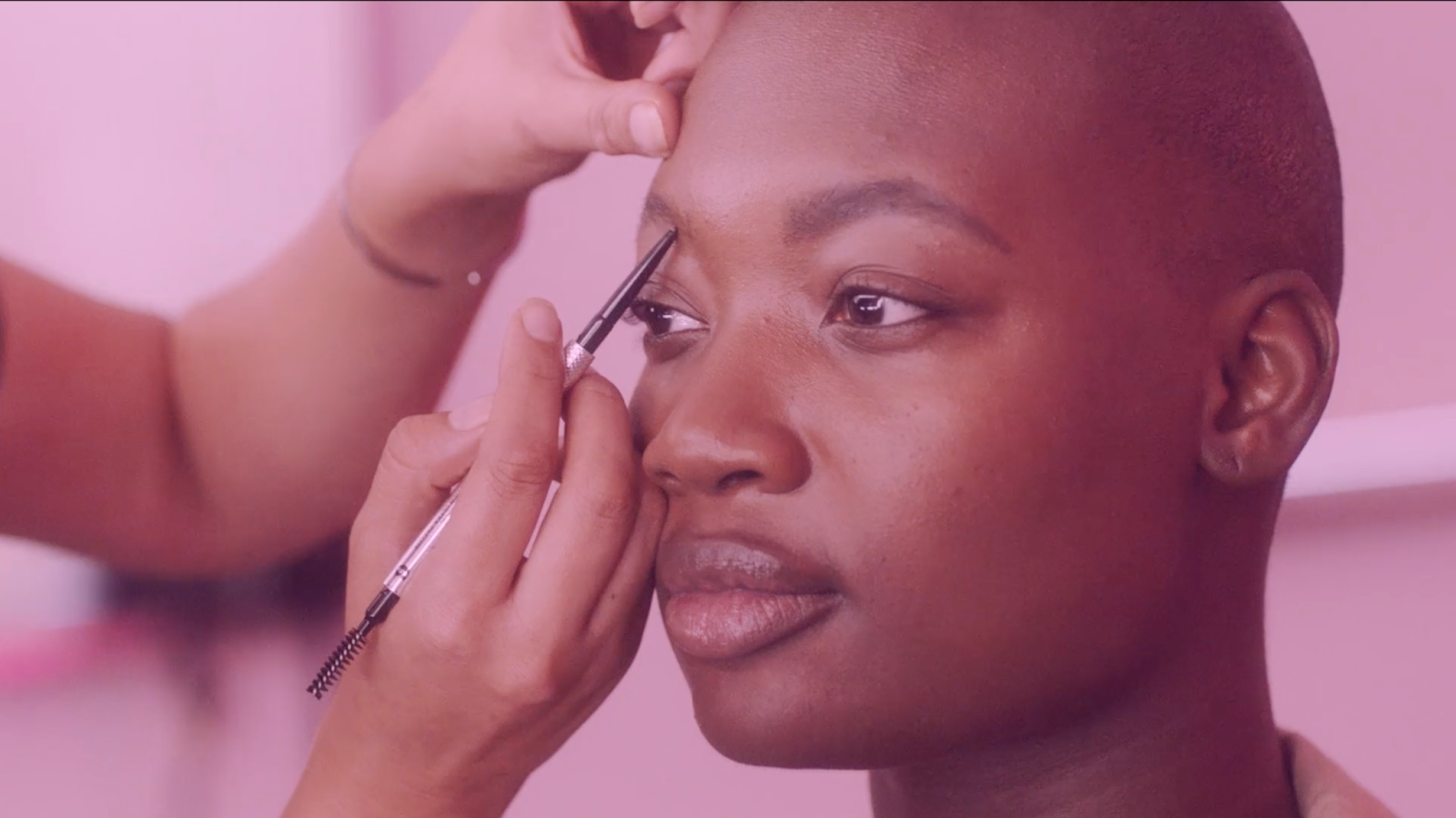
Pink
Pink can create feelings of femininity, playfulness, and beauty. For a campaign with Benefit Cosmetics, we utilized a heavy pink lighting style and set design that matched the light and playful actions of the talent.
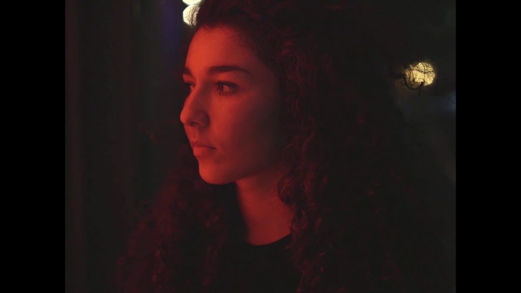
Blue
Since blue is a cooler color, it’s often associated with the cold, isolation, calm, stillness, maybe even a bit of melancholy.
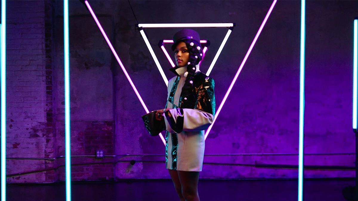
Purple
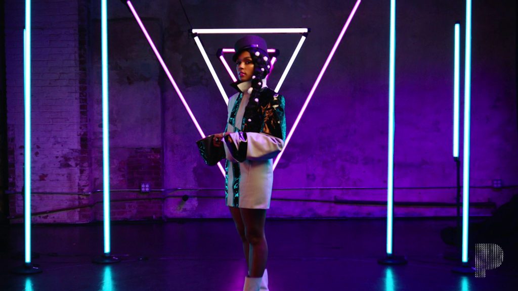
Purple is associated with creating an ominous tone, or something mystical or fantasy. With purple being the dominant tone here, alongside some blues and pinks, we were able to create a fantastic and futuristic look for this piece.
Black and White
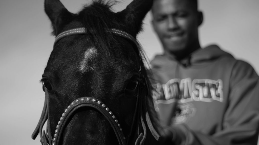
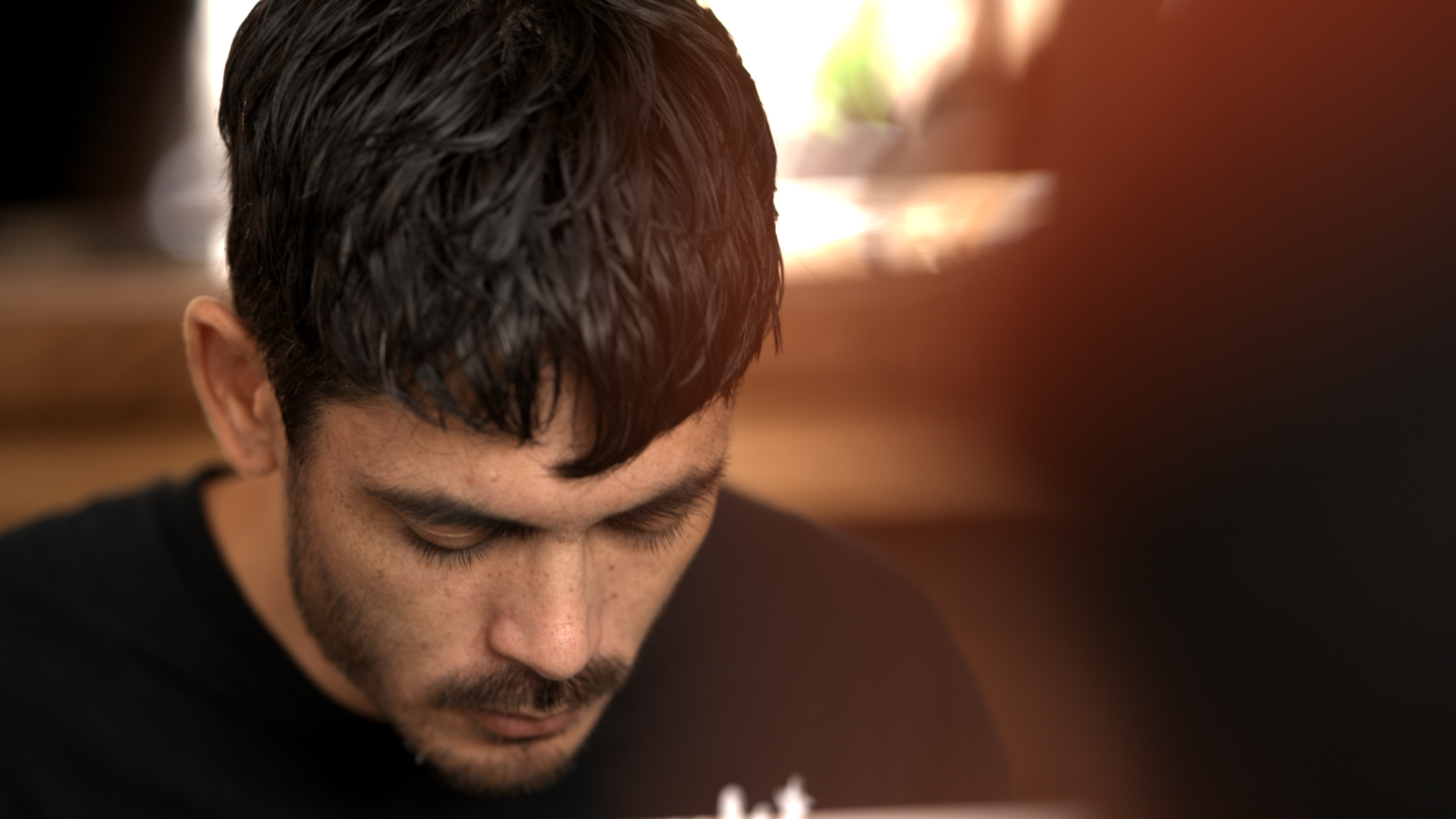
Then there’s the option to remove color entirely and use black and white as a palette. Removing color and filming something in black and white, can entirely create a mood of its own. Usually something that is pensive, moody, and contemplative.
Color Temperature
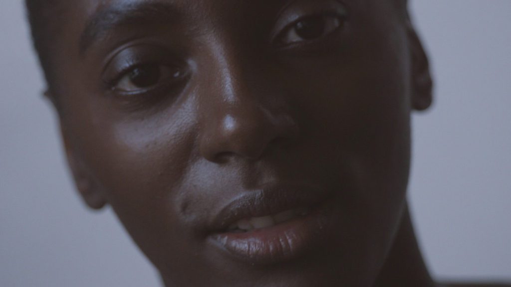
Outside of props, costume, and lighting, perhaps the most simple way of influencing mood and ambience can be done through color temperature. We experience warmer hues in yellows and cooler hues in blues. If we think about how we experience natural daylight, warmer lighting happens around sunrise and sunset and morning and late afternoon lighting. Cooler temperatures happen around dusk, dawn, and when it’s overcast, and in the evening. If we consider practical sources of light, the light from a candle or incandescent bulb is very warm, while fluorescent lighting can read as neutral, or slightly cool. Though color temperature is often used to maintain proper white balance of an image, it can also be used as a way to establish a look or mood.
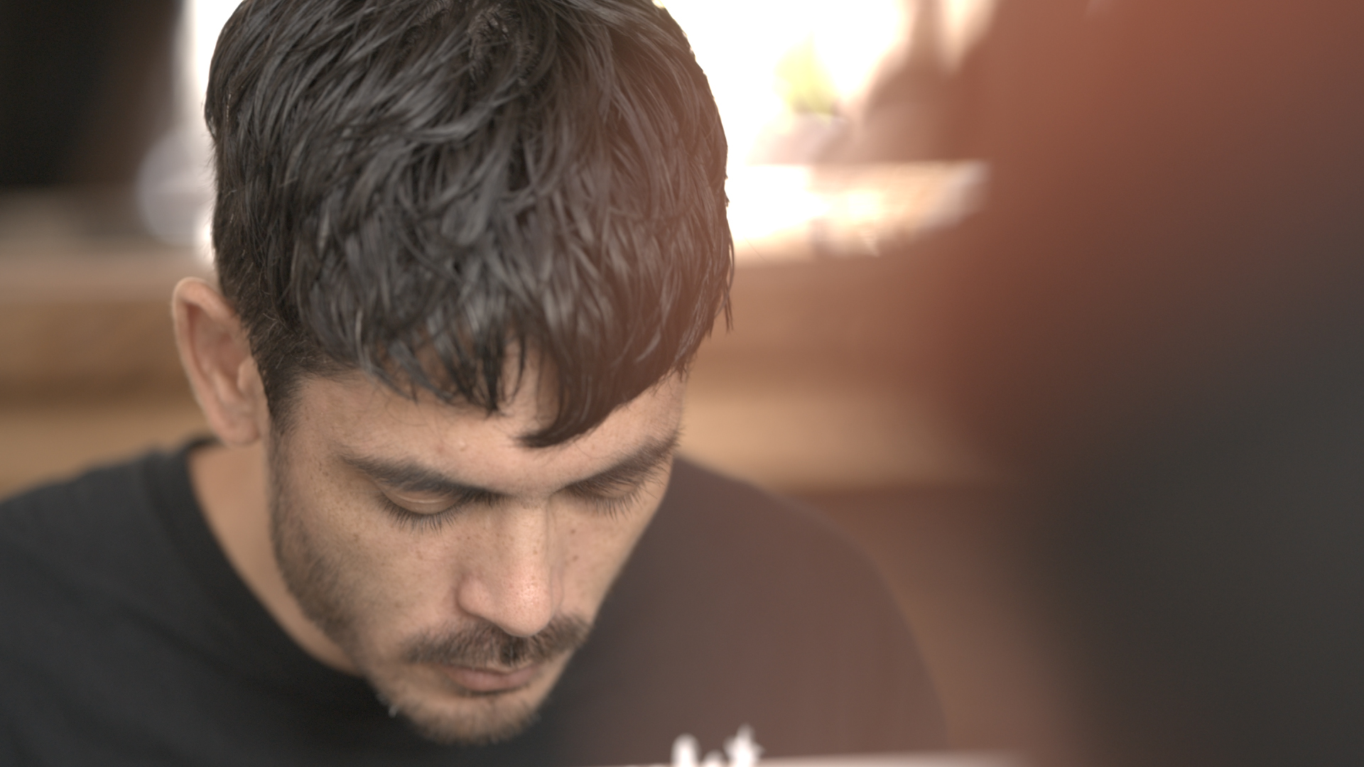
With this project, I wanted to create a slightly warmer and inviting tone and instead of doing that through gels or changing the color temperature of my lights, I changed the white balance of my camera to a slightly cooler temperature, which warmed up the image overall and gave it more of an inviting tone.
How Lenses Affect Color
Lenses are an important step in not only choosing what’s most functional for your project, but also for developing and establishing a look. There are the more practical options to consider. Are you filming in low light conditions? You’ll most likely decide on a set of fast lenses. Are you going to need to move quickly between shot sizes? You’ll probably include some zoom lenses in your kit.
Then there the creative considerations to take into account. The warmth or coolness of lens, how it renders contrast and how it controls or embellishes flares. These characteristics are often determined by the coatings that a lens has. Coatings are primarily used to control reflections and flaring on lenses and differ between lens manufacturers. One set of lenses might yield warmer and softer images, while another might produce cooler and clinical images because of coatings used. Coatings can also affect how a lens renders contrast. Contrast can give you rich and saturated blacks, while lenses with lower contrast give you lifted blacks that can soften resolution. Contrast affects skin tones and can either have skin render as harsh, or soft and delicate.
Flares
Then there are of course, flares. Lenses that have lens coatings, or are uncoated, tend to produce really striking flares. Lenses that are more prone to flaring tend to offer an image that is also softer in contrast, especially when there is light directly hitting a lens. Something else to take into consideration is color consistency between lenses. Some lenses have subtle color shifts across lenses, which might make some lenses render warmer or color than others in the same set. Although this can usually be corrected for in post, it does create an additional step between you and your colorist. Another creative decision to account for is sharpness. Since modern cameras have incredibly sensitive and high resolution sensors, cinematographers often opt for vintage lenses to help offset some of the sharpness you get.
When considering these factors and how they appear in Sigma Cine lenses, I have found that Sigma’s Cines provide sharp, very pleasing and not clinical, lenses that have excellent color matching and consistency throughout each focal length. They tend to be warmer in tone and because of their fast aperture of T1.5, they provide a pleasing bokeh wide open that feels painterly. They are well balanced between sharpness, contrast, and flaring. You can expect these lenses to provide a baseline that produces a warm, soft on skin, sharp on detail, evenly contrasted look to build from. I have used these lenses to film music content, as well as birds and nature.


If I’m looking for something that has low contrast, renders really soft images and provides a high level of flaring, Sigma Classic lenses are the way to go. While testing these lenses at one of my camera preps, I found them to provide characteristics that could provide a wide range of looks for narrative films, commercials, and branded content spots.


Color Grading and the Colorist
The color grade is a crucial, final step in the filmmaking process and where an image comes to life. Color grading can often make or break all of the previous choices that a cinematographer has decided on before post-production. At this step, cinematographers work closely with a colorist to primarily do two things: first, address any unwanted distractions, such as correcting for white balance, controlling highlight, and evening out shifts in exposure. and then second, the creative process which brings in style, mood, and story, to each image.
During the color grading process, you are able to determine how much farther you want to push a look that you’ve established earlier on with production design, wardrobe, lighting and lens choices. This can be done through providing a series of reference images, or a mood board, that show how you imagine color being utilized.


Though color grading is one of the final steps of production, considering how color and tone is used during this step can also happen before you even go into production. If you are able to bring a colorist early onto a project, you could setup a test shoot and test grading with that footage so that you and a colorist could establish a look beforehand as opposed to creating one after.
The Importance of Color in Filmmaking
Color is a powerful element of storytelling that requires thoughtful decision making at various stages of production. From deciding which lens to use, to how you work with a colorist, the choices made around color influences how an audience feels and reacts to what is happening, both at a conscious and unconscious level. Whether your objective is to create a tone that bold and direct and full of reds, or one that’s more subdued and contemplative with hues of blue, color adds a complicated dimension to any cinematographer’s visual storytelling.
Read More:
Mastering Natural Light Cinematography
Excellent article!